Recently much has been said and written about the new Airtel Logo. While I don’t think I have the credential of critiquing the logo on the basis of its design and the thought behind this new logo, I would like to dwell a bit on the topic that has been mentioned in few sites, that is its similarity to Vodafone’s own logo.
Some features in the logo are similar to the Vodafone logo:
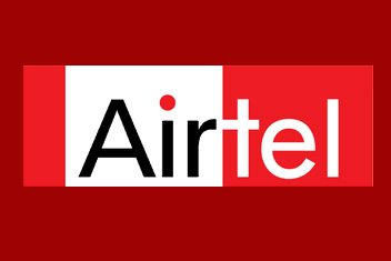
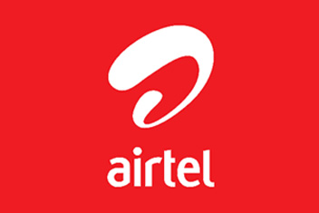
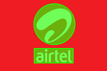
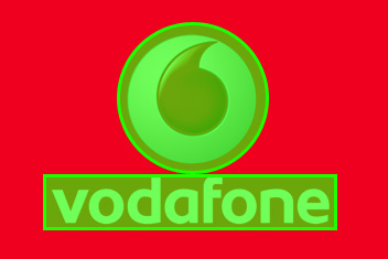
Before we begin, here is a look at all the three logo, the New Airtel Logo, The Vodafone Logo and the Old Airtel logo.


The Basic Shape:
The old logo had a basic shape of a rectangle, but the new logo sport a shape which is pretty similar to Vodafone, which is a round object with a rectangular base.


The Colour:
The new logo is white and is usually placed in a background which is red, this is again a trademark of the Vodafone logo. The old logo where as had a very distinct black colour as part of its logo.
The Typography
The old logo was in Title Case, but the new logo again like the Vodafone logo is all in lower case. Even the choice of font is pretty similar.


Conclusion
I think Airtel has lost a bit of its distinctive brand image with this new logo. Since most hoardings and Mobile connection outlets might display one of them or both together, Airtel should have come up with a logo which was pretty distinct from Vodafone and not similar to it. Some have argued that it was designed by the same company, I find it hard to believe that a company of that stature cannot come up with something which is different from its competitor.
great case study and the conclusion seems a bit too quick. I guess when i saw the logo i felt it looked more like the new videocon logo.
what it is supposed to represent i am still clueless about
The conclusion was just a note to tie the loose end up and give a conclusion to this whole exercise. Base on what I read in other sites, it is suppose to be a lowercase “a” which stands for being dynamic and fun as well.
so the question is, is change always necessary? would a consumer base their choice on the product feature itself or the branding?
Change sometimes does becomes necessary when the vision of the company and the market in which the company deals in changes. Very few companies (Eg. Nike and BMW) has logo and brand image that has withstood the test of time.
Interesting analysis.
Maybe it was intentional that they look similar! Depending on who has more dominance (I am guessing Airtel), people will quickly forget that Airtel copied Vodafone and think the other way instead.
I think in the long run it does not matter who copied who, having two logo that sends out the same visual signal does no good to either of the company.
As the call rates drops significantly, the future of GSM industry in India would be collaboration between two or more ISP under one banner inorder to control infrasturcture cost and survive.
So this change of logo could probably be a part of their future collaborative vision.
Oh yeah – I do agree with Pete, the new Airtel logo looks like a existing Videocon logo – stripped and turned upside down. lol
Vodafone and Airtel coming together? I am not too sure about that. As for its resemblance to Videocon logo inverted, good observation from Petes, I never thought of it like that.